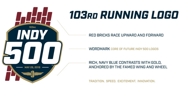
The logo for the 103rd Indianapolis 500 includes bold, dynamic features that will form the core of future logos for “The Greatest Spectacle in Racing” as part of a new system.
The hallmark of the new logo system, which creates a visual platform worthy of one of the world’s premier sporting events, is the type lock-up. This wordmark is athletic, prestigious and confident and includes a rich navy blue that contrasts with gold, the color of the iconic Wing and Wheel logo of the Indianapolis Motor Speedway.
This lock-up will serve as the foundation of the new system and the core of future Indianapolis 500 logos, creating a strong, consistent annual brand appearance for the event.
“This new logo system is an exciting step forward for the identity of the Indianapolis 500,” IMS President J. Douglas Boles said. “The 103rd Indianapolis 500 logo, created within this system, salutes the traditions and legacy of the race while looking ahead to its bright future.”
The 103rd Indianapolis 500 logo is the first of this new system. The new Indy 500 wordmark breaks outside its badge and is anchored by the famous Wing and Wheel.
A row of red bricks race upward and forward, referencing the bricks that formed the track’s surface for decades and remain present today in the famous Yard of Bricks at the start-finish line.
Fans can visit IMS.com/renewal now to purchase tickets for the 103rd Indianapolis 500 and lock in seats at the lowest prices available.
IMS PR


